Anaheim Ducks
Founded in 1993 after the Disney movie The Mighty Ducks, although no longer owned by Disney, the Anaheim Ducks are ranked 7th in the Pacific Division.
Research
The Ducks are based out of Anaheim, a city in Orange County, California. A very sunny location, know for its history, theme parks, beaches and mural art.
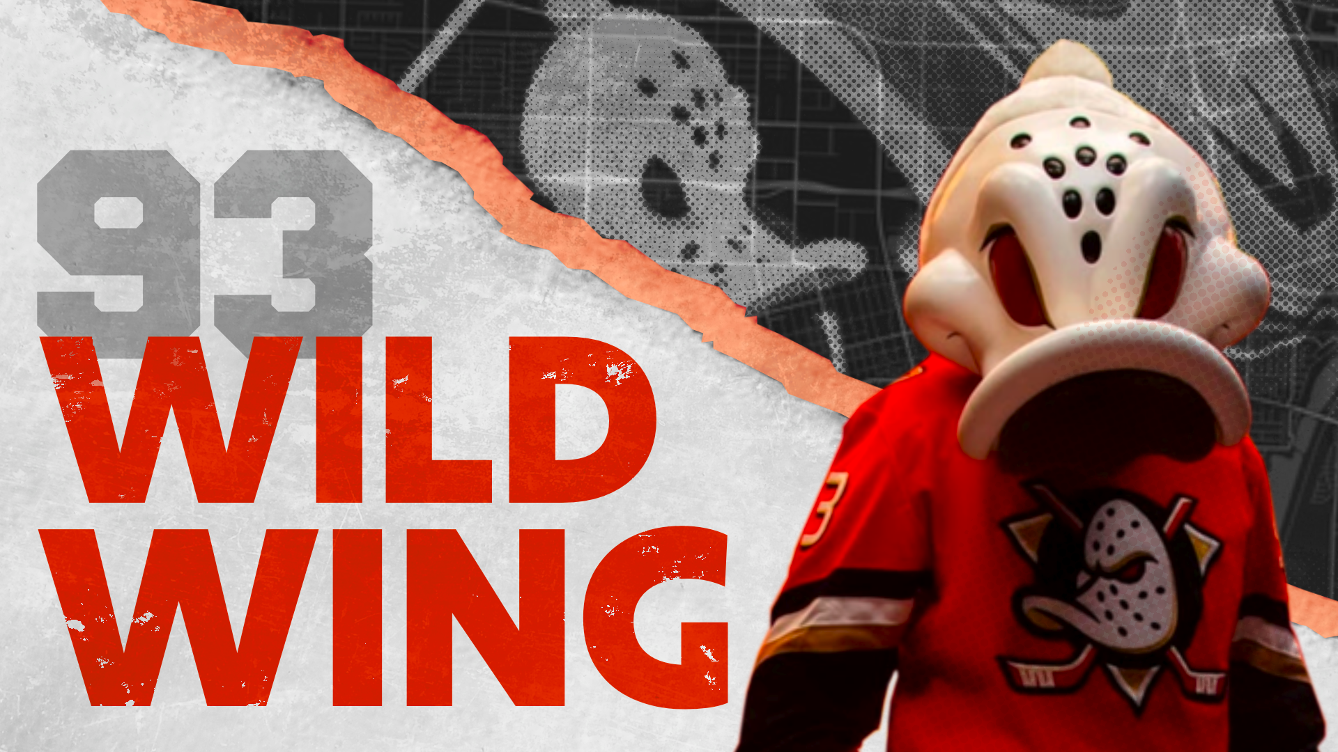
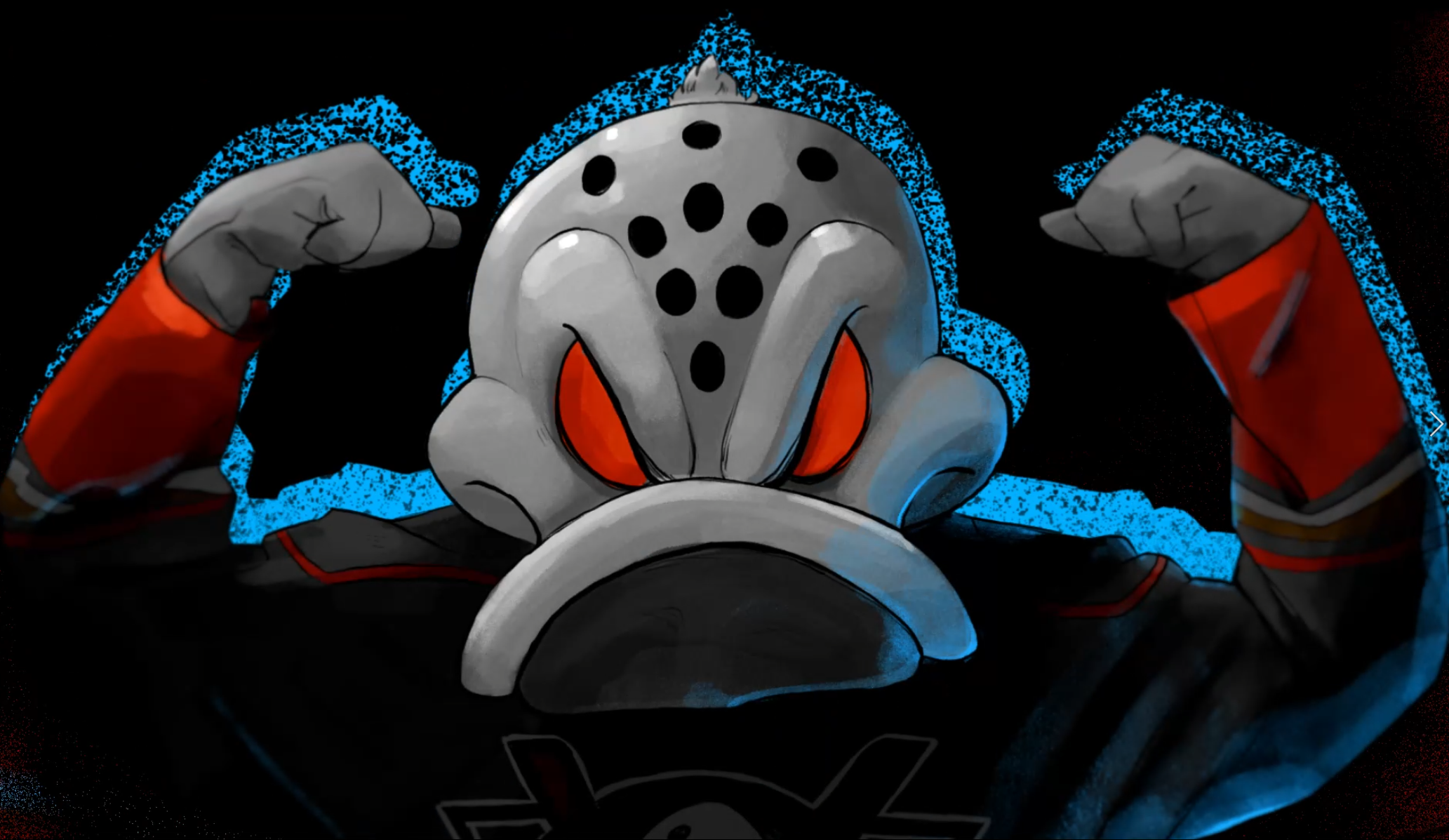
The team is know for, Wild Wing, one of the best mascot designs within the NHL, with popularity comparable to Gritty from the Philadelphia Flyers. They embrace their mascot by having a big welcoming ceremony for Wild Wing every game.
The Objective
My objective for this project is to create animations that embraces the unique culture of Anaheim, while also having a sense of aggression to engage fans.
Final Animation
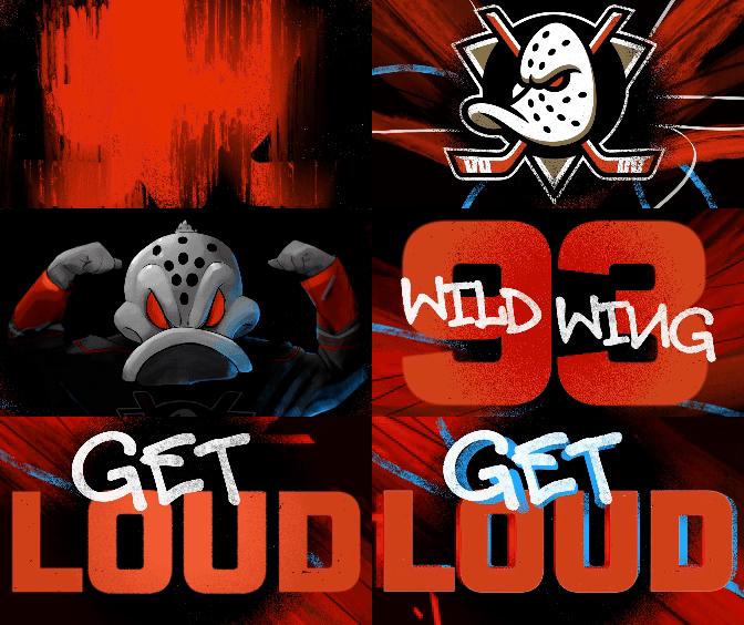
ALL TOGETHER WITH MOCKUP
Concept 1: Newsprint History
BOLD
VINTAGE
UPBEAT
I also wanted to feature the different eras of the team by featuring, old photos, logos and mascot designs to celebrate how far they’ve come.
I wanted to really embrace the location of Anaheim and its history by featuring the map in this design.
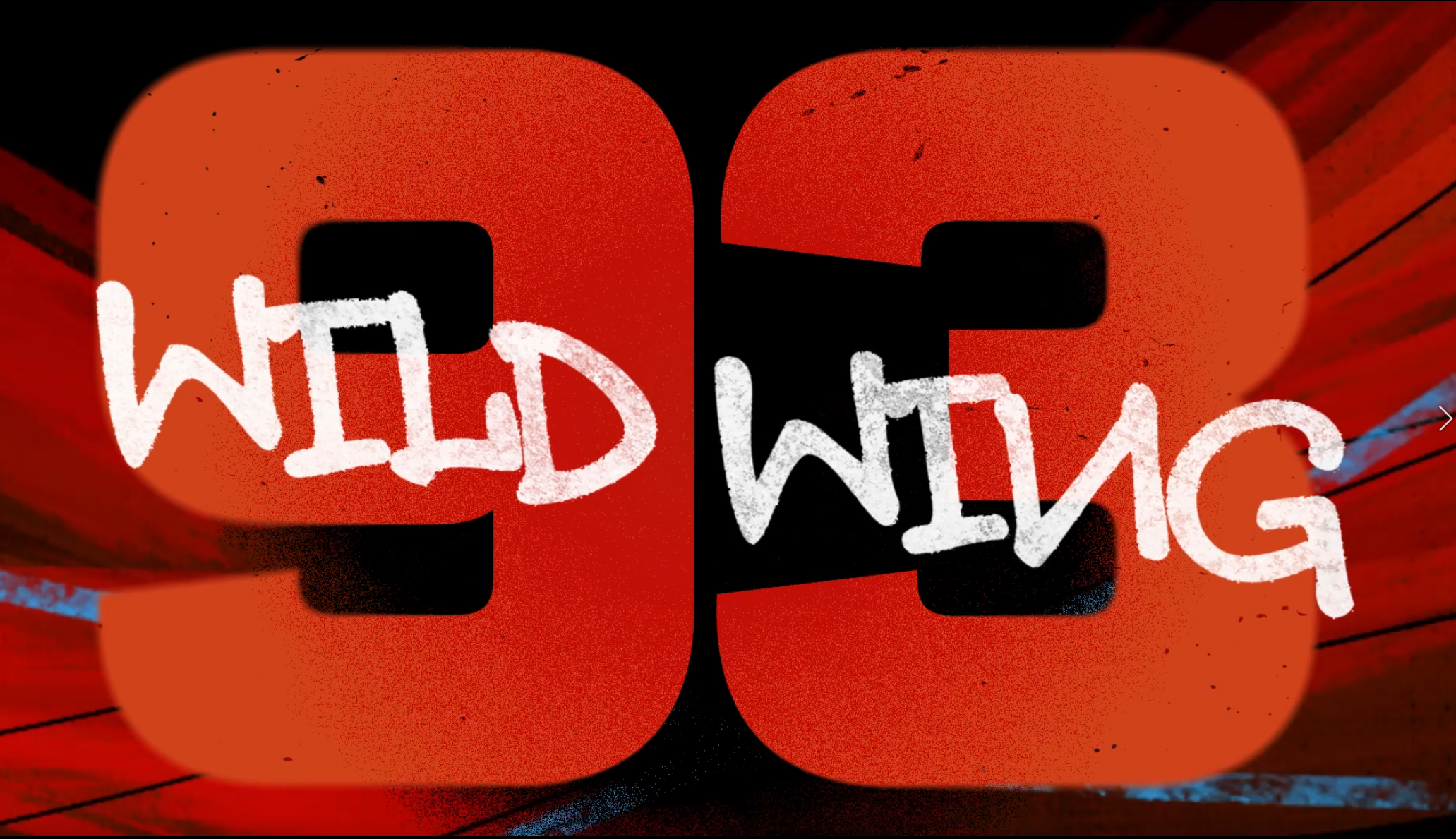
Concept 2: Graffiti Aggression
COOL
WILD
POWER
The movement of the lines and the spray-paint texture also mimics the movements of ice-skating.
In this design direction, I wanted to focus on paying homage to the art that is all around Anaheim.
Revised Styleframes
SIMPLIFY AND UNIFY
I wrote down design rules for this project to insure that there wouldn’t be too many elements or too much happening on screen, as I think its important for these graphics to highlight the game, not distract from it.
A fantastic piece of advice I got from my Art Director was, “simplify and unify”. This helped me to pair down the elements I had on screen, since the design would need to be clear from the nose bleeds of the Honda Stadium.
Process
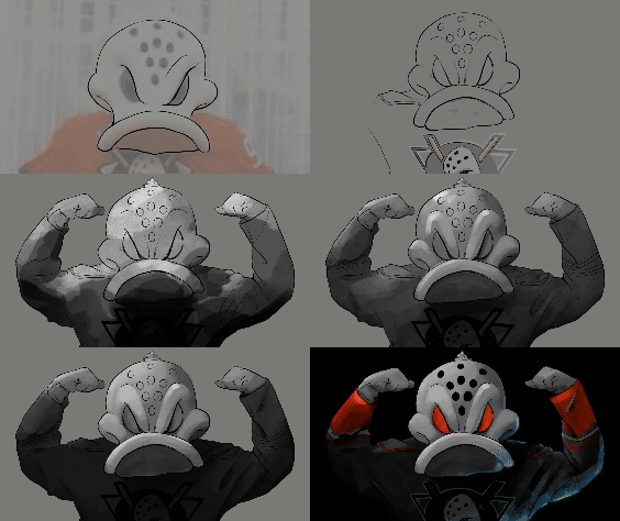
HOW WAS IT MADE
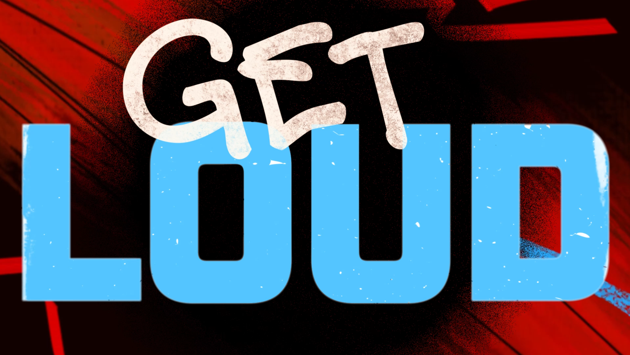
For my type choice, I chose two options that contrast each other. A script graffiti font mixed with a more traditional vector font.
Although I spent time in After Effects trying to get the exact graphic transition I wanted, I concluded that it would be more time-efficient to draw out the transition frames in Procreate
Although seemingly counterintuitive, this allowed me to completely control the look of the transition. Using the same brushes I used for the background animation also helped unify the visual look.


